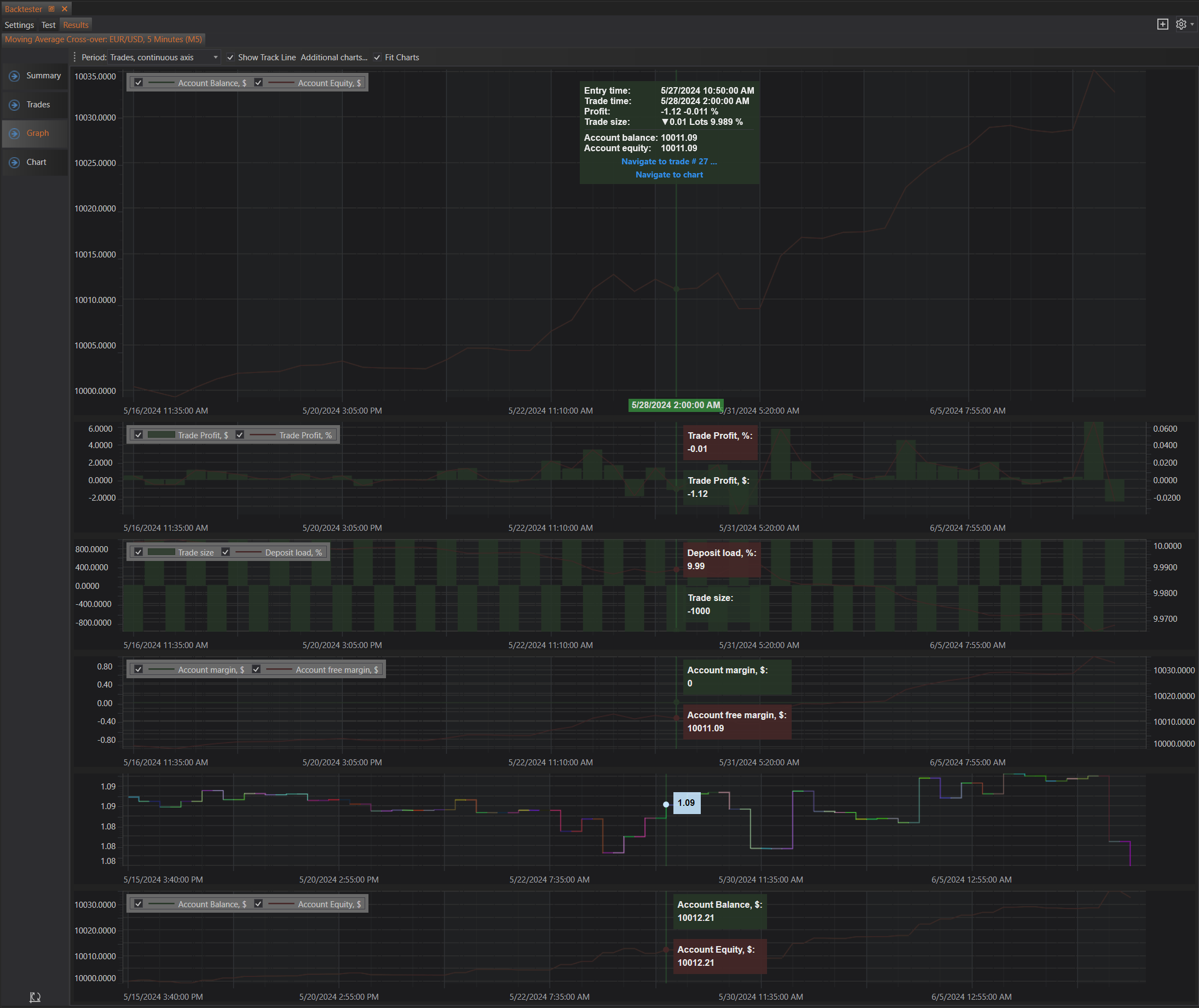
The Graph section in the Backtester Results tab provides a detailed visual representation of various performance metrics for your backtesting session. It helps traders analyze the results and understand the dynamics of their strategies more effectively. This section is divided into multiple sub-sections and features that offer comprehensive insights into the backtest.
Main Components
Period Selector
At the top of the Graph section, there is a period selector that allows users to choose the timeframe over which the data is displayed. This feature enables users to focus on specific periods or view the entire backtesting duration. The available options are:
- Trades, Continuous Axis: Displays trades on a continuous time axis, ideal for seeing trade frequency and clustering.
- Trades, Discontinuous Axis: Shows trades with gaps where no trades occurred, focusing on trade events.
- Daily: Aggregates data on a daily basis, useful for daily performance analysis.
- Weekly: Aggregates data weekly, providing a broader view of performance trends.
- Monthly: Aggregates data monthly, ideal for long-term performance evaluation.
Track Line and Fit Charts
- Show Track Line: Enabling this option displays a vertical line on the graph that helps users precisely inspect specific data points. As you move the cursor, the track line moves, showing detailed information for the exact position.
- Fit Charts: This option automatically adjusts the scale of the graphs to fit within the viewable area, ensuring all data points are visible without the need for manual scrolling or zooming.
Additional Charts
Users can select additional charts to be displayed for a more comprehensive analysis. These charts can be toggled on or off based on the user's preference. The available additional charts include:
- Trade Profit: Shows the profit for each trade, helping to identify which trades were profitable and which were not.
- Trade Size and Deposit Load: Displays the size of each trade and the corresponding deposit load, indicating how much capital was allocated per trade and the leverage used.
- Account Margin: Illustrates the margin used by the account over time, providing insights into the account’s leverage and risk exposure.
- Trade Timeline: A chronological timeline that shows the sequence and timing of trades, helping to understand the trading frequency and intervals between trades.
- Balance and Equity on Entries: Shows the account balance and equity at the time of trade entries, offering a snapshot of the account’s state at the start of each trade.
Detailed Graphs
Account Balance and Equity
This graph displays the progression of the account balance and equity over the backtest period. It provides a visual overview of how the strategy affected the account’s financial state, showing gains, losses, and overall performance.
Trade Profit
The Trade Profit graph shows the profit or loss for each individual trade made during the backtest. It helps in identifying which trades were profitable and which resulted in a loss, providing insights into the effectiveness of the trading strategy.
Trade Size and Deposit Load
This graph displays the size of each trade and the corresponding deposit load. It indicates how much capital was allocated per trade and the leverage used, helping to understand the risk and capital management aspects of the strategy.
Account Margin
The Account Margin graph illustrates the margin used by the account over time. It provides a view of the account’s leverage and risk exposure, showing how margin requirements and usage evolved during the backtest.
Trade Timeline
The Trade Timeline graph provides a chronological view of the trades made during the backtest. It shows the sequence and timing of trades, helping to understand the trading frequency and the intervals between trades.
Balance and Equity on Entries
This graph displays the account balance and equity at the time of each trade entry. It offers a snapshot of the account’s state at the start of each trade, providing insights into how the account’s financial position influenced trading decisions.
Interactive Features
Tooltips
Hovering over any data point in the graphs displays detailed tooltips with information such as entry time, trade time, profit, trade size, account balance, and account equity. These tooltips help in quickly understanding the specifics of each data point without needing to cross-reference other sections.
Navigation
Users can navigate to specific trades on the chart by using the provided navigation options. This feature allows for a closer inspection of particular trades and their impact on the overall strategy performance. For instance, clicking on a specific trade point can take the user to the corresponding detailed trade data in the Trades section.
- Navigate to trade #: Clicking this will open the Trades section of Results and highlight the specific trade.
- Navigate to chart: Clicking this will open the Chart section of Results, highlight the trade in the trades table, and also show the trade on the chart.
Summary
The Graph section in the Backtester Results tab is an essential tool for visualizing the performance of trading strategies. It offers multiple customizable graphs and interactive features that provide deep insights into the backtest results. By allowing users to toggle different views, adjust timeframes, and inspect detailed data points, it helps traders fine-tune their strategies for better performance and more informed decision-making.