Mountain on OHLC Charts: Visualizing Market Peaks and Valleys
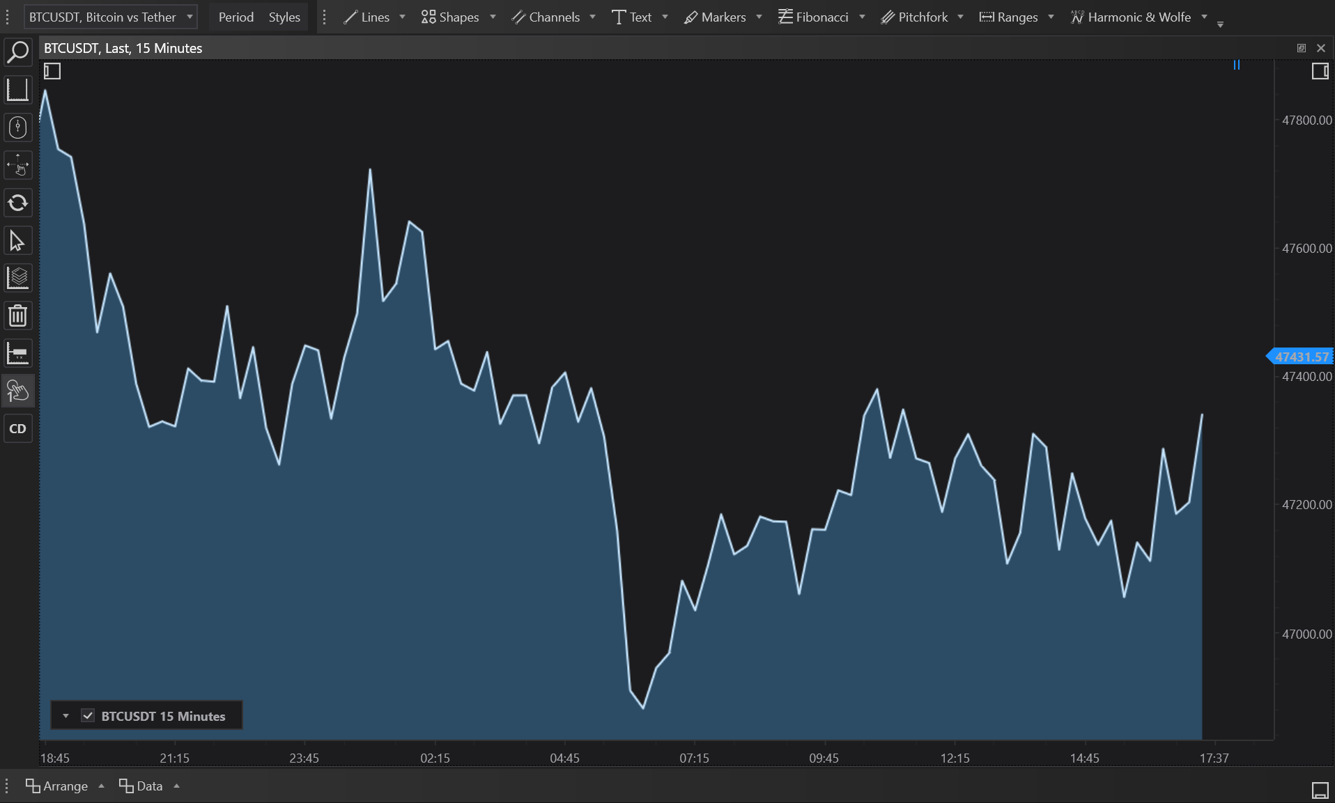
Mountain charts in FinStudio provide a dynamic and intuitive way to visualize price movements by focusing on key market values—Open, High, Low, and Close. These charts emphasize the magnitude of price movements over time by filling the area beneath the price line, offering a 'mountain-like' appearance that highlights the peaks and troughs of market trends. This article will explore the historical context, principles, and applications of Mountain on OHLC charts, focusing on their unique implementations within FinStudio.
Historical Context
The Mountain chart style, while not as ancient as candlestick charting, has been a staple in financial visualization due to its straightforward and impactful display method. It derives from line charts but adds a filled graphical representation to better illustrate the volume and progression of price changes over time, enhancing the visual impact and ease of analysis.
Basic Principles of Mountain on OHLC Charts
Mountain on OHLC charts are line charts that extend the concept by filling the area under the line. This visualization technique helps in quickly assessing the overall market direction and volatility:
- Open: Connects the opening prices of each period and fills the area under this line.
- High: Focuses on the highest prices achieved during the trading sessions, emphasizing market peaks.
- Low: Highlights the lowest prices, showing critical support levels or market troughs.
- Close: Links the closing prices, providing insights into how the market settled at the end of each trading period.
Types of Mountain on OHLC Charts in FinStudio
FinStudio provides a versatile range of Mountain on OHLC charts to cater to different analytical needs:
- Mountain on Open Values: Tracks the opening prices, ideal for analyzing start-of-period market sentiment.
- Mountain on High Values: Emphasizes the highest prices reached, useful for spotting potential resistance levels.
- Mountain on Low Values: Shows the lowest prices, aiding in identifying key support levels.
- Mountain on Close Values: Follows the closing prices, crucial for understanding the end-of-period market consensus.
Each type provides a distinct perspective on market dynamics, allowing traders to tailor their analysis based on specific trading strategies or insights sought.
Application and Benefits
Mountain on OHLC charts are particularly effective for visualizing longer-term trends and patterns:
- Trend Analysis: The filled area makes it easier to see periods of sustained growth or decline, as the 'mountain' or 'valley' formations become more pronounced.
- Volatility Insight: By observing the width and height of the filled areas, traders can gauge market volatility. Wider mountains suggest larger price ranges within the period.
- Comparative Analysis: Traders can compare different OHLC values side-by-side to get a comprehensive view of market behavior.
Examples of Use
- Identifying Trend Reversals: A shift from a rising mountain to a declining one might indicate a potential reversal, prompting a strategy adjustment.
- Support and Resistance Levels: Peaks and troughs can serve as historical support and resistance levels, guiding entry and exit points.
Advantages and Limitations
Advantages:
- Enhanced Visibility: The filled graphical representation makes it easier to visualize the overall trend and its strength.
- Intuitive Interpretation: New traders often find mountain charts easier to interpret compared to more complex chart types.
Limitations:
- Over-Simplification: Important details available in candlestick or bar charts, like intra-period volatility, might be missed.
- Lag in Reaction: As with most OHLC-based charts, there's a natural lag in depicting real-time market changes.
Conclusion
Mountain on OHLC charts in FinStudio offer a visually striking and effective way to analyze market trends. By providing a clear, filled representation of price movements, these charts help traders and analysts quickly assess market conditions and make informed decisions based on visual trends. While they are a powerful tool for visual analysis, they should be used in conjunction with other indicators and chart types to ensure a well-rounded approach to market analysis.