Overview
The Curve tool in FinStudio is designed to draw smooth, flowing lines through specified points on a chart. It is particularly useful for tracing price movements that do not adhere strictly to straight lines, allowing analysts to highlight trends or potential pattern formations with greater flexibility.
Functionality of the Curve Tool
- Flexible Trend Lines: Unlike straight line tools, the Curve tool allows for the creation of lines that can bend and adapt to more dynamic market movements.
- Visual Flow: Helps in visualizing the natural flow of price movements, making it easier to interpret soft trends and rounded turns that are typical in market cycles.
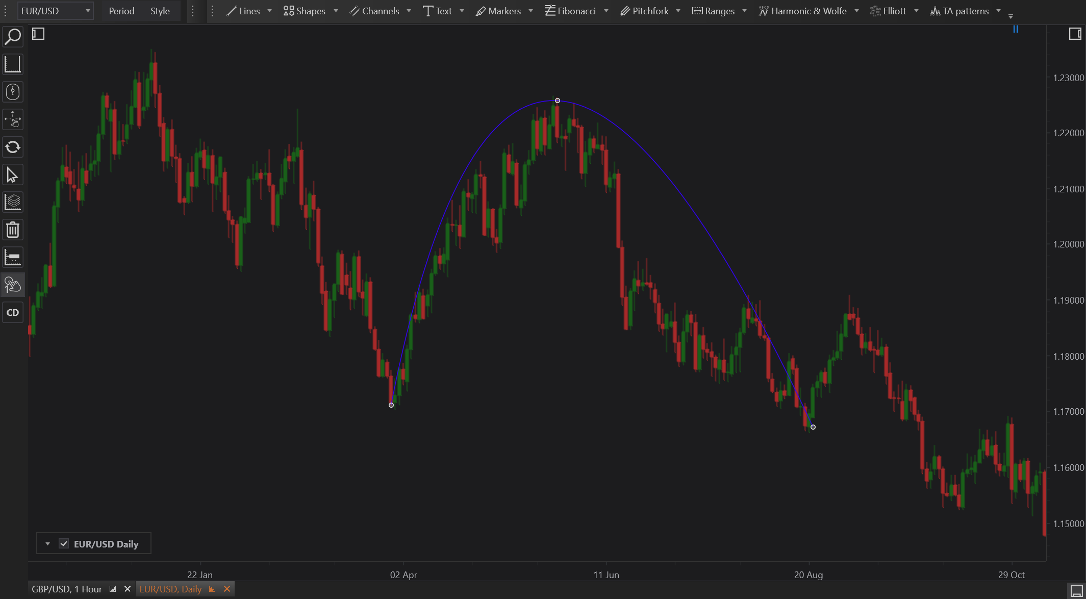
How to Use the Curve Tool
- Select the Curve Tool: Access the Curve tool from FinStudio’s drawing tools toolbar.
- Plot Points: Click to place points on the chart where you want the curve to pass through. The tool will automatically generate a smooth curve that connects these points.
- Adjust Properties: Modify the curve’s properties such as color, thickness, and opacity through the Properties section to match your analysis style or to increase visibility.
- Refine the Curve: You can add or remove points or adjust their position to reshape the curve as needed to better fit the market data.
Filled Curve
FinStudio also offers variation of Curve - Filled Curve. The filled curve version's shape area is filled.
Practical Examples
- Following Market Trends: Use the Curve tool to trace gentle inclines or declines in the market, providing a visual representation of potential trend continuations or exhaustions.
- Highlighting Cyclical Patterns: The Curve tool can be ideal for outlining cyclical patterns in markets, such as repetitive peaks and troughs that occur over regular intervals.
Advantages
- Visual Appeal: Curves provide a more aesthetically pleasing and accurate representation of fluid market movements than straight lines.
- Adaptability: Easily adjustable, allowing analysts to refine their visual interpretations as new data becomes available or market conditions change.
Limitations
- Subjectivity: The placement of curves can be highly subjective and may vary significantly between analysts, potentially leading to different interpretations of the same chart data.
- Complexity: Requires a good eye for chart analysis, as improperly drawn curves can mislead rather than aid in understanding market dynamics.
Conclusion
The Curve tool in FinStudio offers a versatile way to enhance chart analysis by allowing for the depiction of complex market dynamics that are not strictly linear. By providing the ability to smoothly connect various data points, this tool helps in creating a more nuanced and visually compelling analysis that can adapt to the organic flow of market prices.