The Correlation tab within the Properties of the Result Analysis module allows users to manage the color coding for different correlation ranges. This customization helps in visualizing the correlation data more effectively by assigning specific colors to predefined correlation ranges.
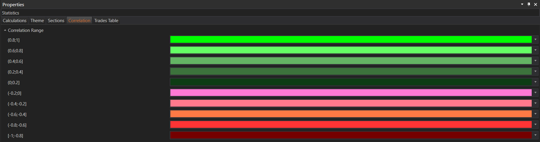
Correlation Range
-
(0.8;1]
- Description: Represents strong positive correlation.
- Color: Bright green (default).
-
(0.6;0.8]
- Description: Represents moderately strong positive correlation.
- Color: Light green (default).
-
(0.4;0.6]
- Description: Represents moderate positive correlation.
- Color: Medium green (default).
-
(0.2;0.4]
- Description: Represents weak positive correlation.
- Color: Dark green (default).
-
(0;0.2]
- Description: Represents very weak positive correlation or no correlation.
- Color: Darkest green (default).
-
(-0.2;0]
- Description: Represents very weak negative correlation or no correlation.
- Color: Light pink (default).
-
(-0.4;-0.2]
- Description: Represents weak negative correlation.
- Color: Pink (default).
-
(-0.6;-0.4]
- Description: Represents moderate negative correlation.
- Color: Light orange (default).
-
(-0.8;-0.6]
- Description: Represents moderately strong negative correlation.
- Color: Orange (default).
-
[-1;-0.8]
- Description: Represents strong negative correlation.
- Color: Bright red (default).
Example of Correlation Ranges Visualization
These settings enable users to easily identify the strength and direction of correlations between different reports, providing a clear visual representation that aids in the analysis of portfolio correlations.