The Theme tab within the Properties of the Result Analysis module allows users to customize the visual appearance of the module. This tab is divided into several sections:
Toolbar
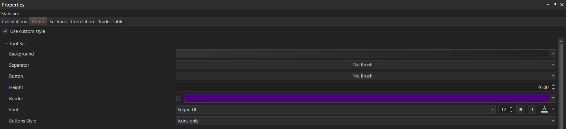
- Background: Customize the background color or pattern of the toolbar.
- Separator: Define the appearance of separators between toolbar buttons.
- Button: Customize the appearance of toolbar buttons.
- Height: Adjust the height of the toolbar.
- Border: Define the border style and color for the toolbar.
- Font: Customize the font used in the toolbar.
- Buttons Style: Choose the style of buttons, such as icons only or text and icons.
Tab Control
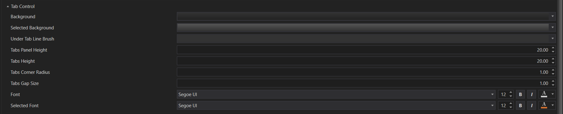
- Background: Set the background color or pattern for tabs.
- Selected Background: Customize the background for the selected tab.
- Under Tab Line Brush: Define the color or style of the line under the selected tab.
- Tabs Panel Height: Adjust the height of the tabs panel.
- Tabs Height: Set the height of individual tabs.
- Tabs Corner Radius: Customize the corner radius of tabs.
- Tabs Gap Size: Define the gap size between tabs.
- Font: Customize the font used for tab text.
- Selected Font: Set the font for the selected tab.
Table
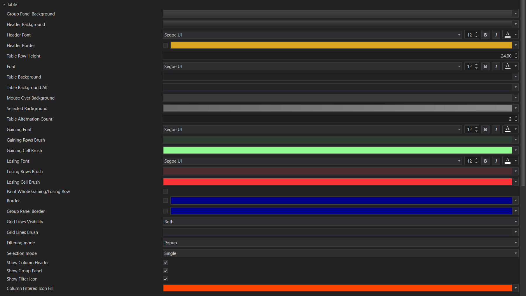
- Group Panel Background: Customize the background of the group panel.
- Header Background: Set the background color for table headers.
- Header Font: Define the font for table headers.
- Header Border: Customize the border for table headers.
- Table Row Height: Adjust the height of table rows.
- Table Background: Set the background color for table cells.
- Table Background Alt: Define an alternate background color for table rows.
- Mouse Over Background: Customize the background color when hovering over table cells.
- Selected Background: Set the background color for selected table cells.
- Table Alternation Count: Define how often rows should alternate background colors.
- Gaining Font: Customize the font for rows showing gains.
- Gaining Rows Brush: Define the background color for rows showing gains.
- Gaining Cell Brush: Set the background color for cells showing gains.
- Losing Font: Customize the font for rows showing losses.
- Losing Rows Brush: Define the background color for rows showing losses.
- Losing Cell Brush: Set the background color for cells showing losses.
- Paint Whole Gaining/Losing Row: Option to paint the entire row for gains or losses.
- Border: Customize the border style for the table.
- Group Panel Border: Define the border for the group panel.
- Grid Lines Visibility: Set the visibility of grid lines.
- Grid Lines Brush: Customize the color and style of grid lines.
- Filtering Mode: Choose between popup or inline filtering.
- Selection Mode: Set the selection mode for table rows.
- Show Column Header: Toggle the visibility of column headers.
- Show Group Panel: Toggle the visibility of the group panel.
- Show Filter Icon: Toggle the visibility of the filter icon.
- Column Filtered Icon Fill: Customize the color of the filter icon when a column is filtered.
Graphs
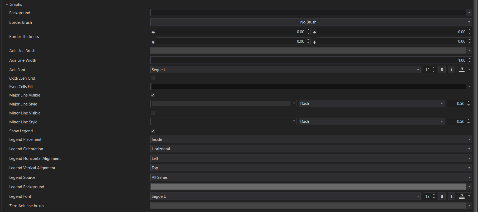
- Background: Customize the background color or pattern for graphs.
- Border Brush: Define the color or style of the graph border.
- Border Thickness: Set the thickness of the graph border.
- Axis Line Brush: Customize the color or style of the axis lines.
- Axis Line Width: Set the width of the axis lines.
- Axis Font: Customize the font used for axis labels.
- Odd/Even Grid: Toggle the visibility of odd and even grid lines.
- Even Cells Fill: Set the background color for even grid cells.
- Major Line Visible: Toggle the visibility of major grid lines.
- Major Line Style: Define the style of major grid lines.
- Minor Line Visible: Toggle the visibility of minor grid lines.
- Minor Line Style: Define the style of minor grid lines.
- Show Legend: Toggle the visibility of the graph legend.
- Legend Placement: Set the placement of the legend (inside or outside the graph area).
- Legend Orientation: Define the orientation of the legend (horizontal or vertical).
- Legend Horizontal Alignment: Set the horizontal alignment of the legend.
- Legend Vertical Alignment: Set the vertical alignment of the legend.
- Legend Source: Define the source for legend items.
- Legend Background: Customize the background color or pattern for the legend.
- Legend Font: Set the font used for the legend text.
- Zero Axis Line Brush: Customize the color or style of the zero axis line.
Chart Palette
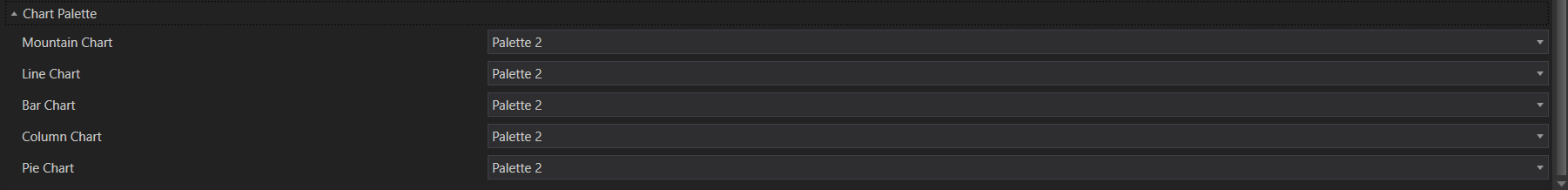
- Mountain Chart: Choose the color palette for mountain charts.
- Line Chart: Choose the color palette for line charts.
- Bar Chart: Choose the color palette for bar charts.
- Column Chart: Choose the color palette for column charts.
- Pie Chart: Choose the color palette for pie charts.
These settings provide extensive customization options to tailor the visual presentation of the Result Analysis module to your preferences.