Overview
The Button properties section within the Application Themes module of FinStudio allows for detailed customization of buttons across the trading platform. Buttons are crucial interface elements that facilitate user actions and commands. Properly configured button properties enhance visual feedback and user interaction, ensuring that buttons are both functional and aesthetically pleasing.
Customizing Button Properties
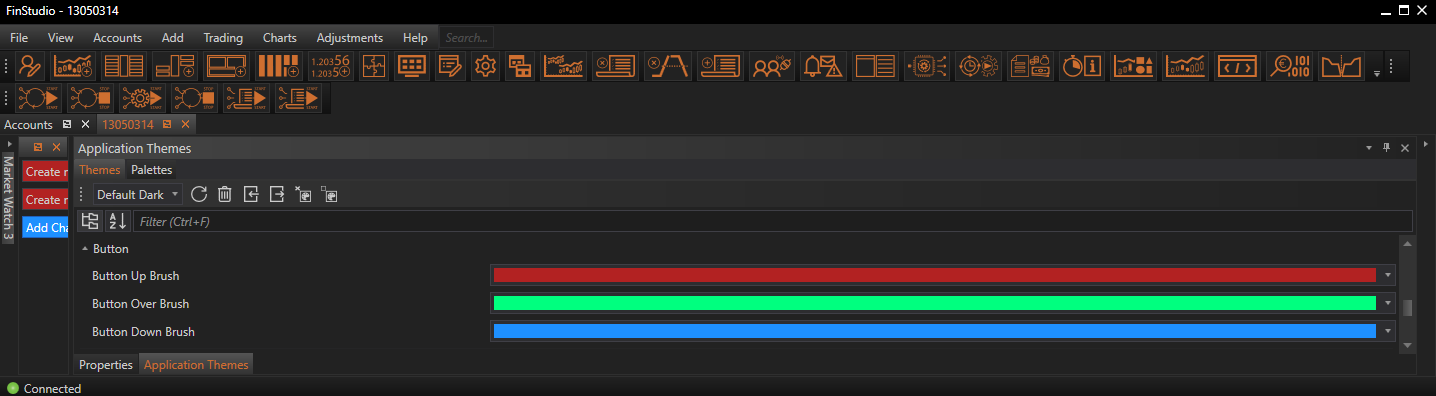
Button Up Brush:
- Functionality: Sets the color of the button when it is in its normal, uninteracted state (Up state).
- Impact: The default color of the button should integrate well with the overall interface but still stand out enough to be immediately recognizable as an interactive element. It forms the base appearance of the button and is crucial for initial user interaction.
Button Over Brush:
- Functionality: Determines the color of the button when the mouse hovers over it (Over state).
- Impact: This color change provides visual feedback that the button is interactive and responsive to user actions. It helps in enhancing the user experience by indicating that the button is ready to be clicked.
ButtonDown Brush:
- Functionality: Specifies the color of the button when it is being clicked (Down state).
- Impact: The Down state color is important for confirming to the user that their click has been registered. A distinct color for this state reinforces the button’s responsiveness and can improve the overall tactility of the user interface.
Implementing Changes: Steps for Customization
-
Access Button Properties:
- Navigate to the 'Button' category within the Theme Tab of the Application Themes module. This section is dedicated to setting properties specific to button aesthetics and behavior.
- Navigate to the 'Button' category within the Theme Tab of the Application Themes module. This section is dedicated to setting properties specific to button aesthetics and behavior.
-
Modify Visual Elements:
- Adjust the colors for the Button Up Brush, Button Over Brush, and Button Down Brush. These settings typically provide a visual preview, allowing you to see the effects immediately and make adjustments as needed.
- Adjust the colors for the Button Up Brush, Button Over Brush, and Button Down Brush. These settings typically provide a visual preview, allowing you to see the effects immediately and make adjustments as needed.
-
Apply and Evaluate:
- Once the desired settings are configured, apply the changes to see how they affect the buttons throughout the application. It’s essential to test the buttons in different states to ensure that the visual cues are clear and effective.
Best Practices
-
Visual Consistency:
- Ensure that the button colors are consistent with the overall design theme of the application. This helps in maintaining a unified look and feel across the platform.
-
Contrast and Visibility:
- Choose colors that contrast well with the button’s background and the overall application background. High contrast helps in distinguishing the button states clearly, which is crucial for accessibility.
-
Feedback and Interaction:
- The color changes between states should be noticeable enough to provide clear feedback to the user. This is particularly important in a fast-paced trading environment where quick and confident interactions are necessary.
-
Testing Across Environments:
- Check the appearance and functionality of buttons under different lighting conditions and on various display settings to ensure they are effective across all user scenarios.
Conclusion
Customizing the Button properties in FinStudio's Application Themes module is key to creating an intuitive and responsive user interface. By carefully adjusting the appearance of buttons across different states, traders can enhance both the visual appeal and the functional efficiency of their trading platform. These settings not only improve the aesthetic quality of the interface but also support effective user interactions, which are essential in high-stakes trading environments.