Overview
The Collapsible properties section within the Application Themes module of FinStudio provides customization options for collapsible panels within the application. These panels are utilized throughout the trading platform to organize content dynamically, allowing users to expand or collapse sections as needed to optimize their workspace. Proper configuration of these elements enhances usability and ensures visual coherence.
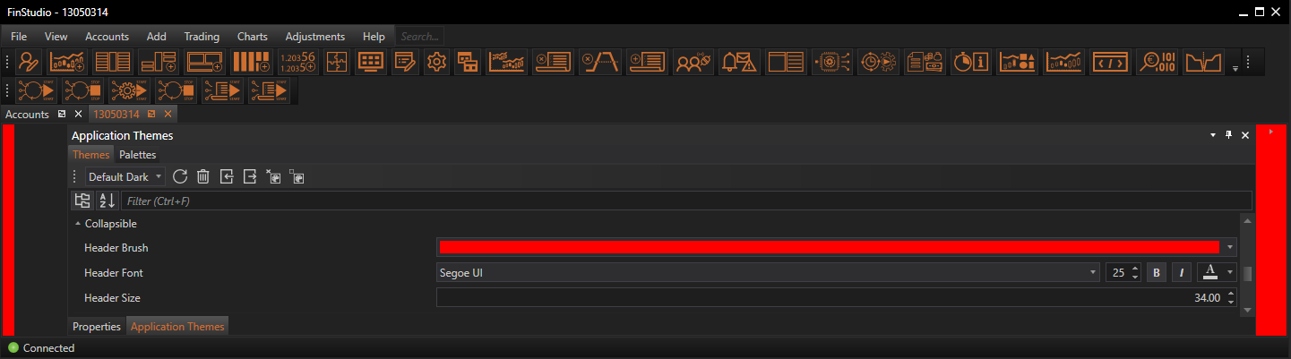
Customizing Collapsible Properties
Header Brush:
- Functionality: Sets the background color of the collapsible panel header.
- Impact: The header color can influence user interaction by making the collapsible panels easily identifiable. A distinct color helps users quickly locate and operate the collapsible functionality, which is essential in managing screen real estate efficiently.
Header Font:
- Functionality: Customizes the font used in the collapsible panel header, including its size and color.
- Impact: Clear and readable fonts are crucial for labeling collapsible panels. The right font settings ensure that users can easily understand what each panel contains, even when collapsed, aiding in navigation and accessibility.
Header Size:
- Functionality: Adjusts the dimensions—typically height, but potentially width, depending on layout orientation—of the collapsible panel header.
- Impact: The size of the header affects not only the visual impact but also the ease with which users can interact with it. Adequate sizing is important to ensure that the headers are easily clickable, enhancing the user experience.
Implementing Changes: Steps for Customization
-
Access Collapsible Properties:
- Navigate to the 'Collapsible' section within the Theme Tab of the Application Themes module to start adjusting the properties of collapsible panels.
- Navigate to the 'Collapsible' section within the Theme Tab of the Application Themes module to start adjusting the properties of collapsible panels.
-
Modify Visual Elements:
- Use the available controls to set the header brush, font, and size. These settings often offer previews to instantly see the effects of your adjustments, helping to iterate and refine the appearance quickly.
- Use the available controls to set the header brush, font, and size. These settings often offer previews to instantly see the effects of your adjustments, helping to iterate and refine the appearance quickly.
-
Apply and Evaluate:
- Once the desired configurations are set, apply the changes to update the collapsible panels throughout the application. Review the modified panels in various states (expanded and collapsed) to ensure the changes enhance both functionality and aesthetics.
Best Practices
-
Consistency Across Panels:
- Maintain consistent design settings across all collapsible panels to ensure a cohesive look throughout the application. Consistency helps users quickly understand and predict the behavior of UI elements.
-
Contrast for Readability:
- Ensure that the header brush and font color provide sufficient contrast for easy readability. This is particularly important in collapsible panels, where headers often serve as the primary indicators of content.
-
Adequate Header Sizing:
- Set the header size to be large enough to facilitate easy interaction but not so large as to dominate the content area unnecessarily. The header should be proportional to the overall size of the panel and the text it contains.
-
Accessibility Considerations:
- Choose font sizes and header dimensions that accommodate users with varying levels of ability. Larger headers and clearer fonts can help make the application more accessible to everyone.
Conclusion
The Collapsible properties section in FinStudio's Application Themes module plays a crucial role in optimizing the functionality and appearance of collapsible panels within the trading platform. By carefully customizing these properties, users can ensure that collapsible panels are not only visually appealing but also enhance the overall user experience by providing efficient, easy-to-use methods for managing the display of complex information.