Overview
The Common properties section within the Application Themes module of FinStudio allows users to set universal design elements that are applied across the entire application. These settings ensure consistency and uniformity in the application’s visual design, enhancing the user experience by providing a cohesive and intuitive interface.
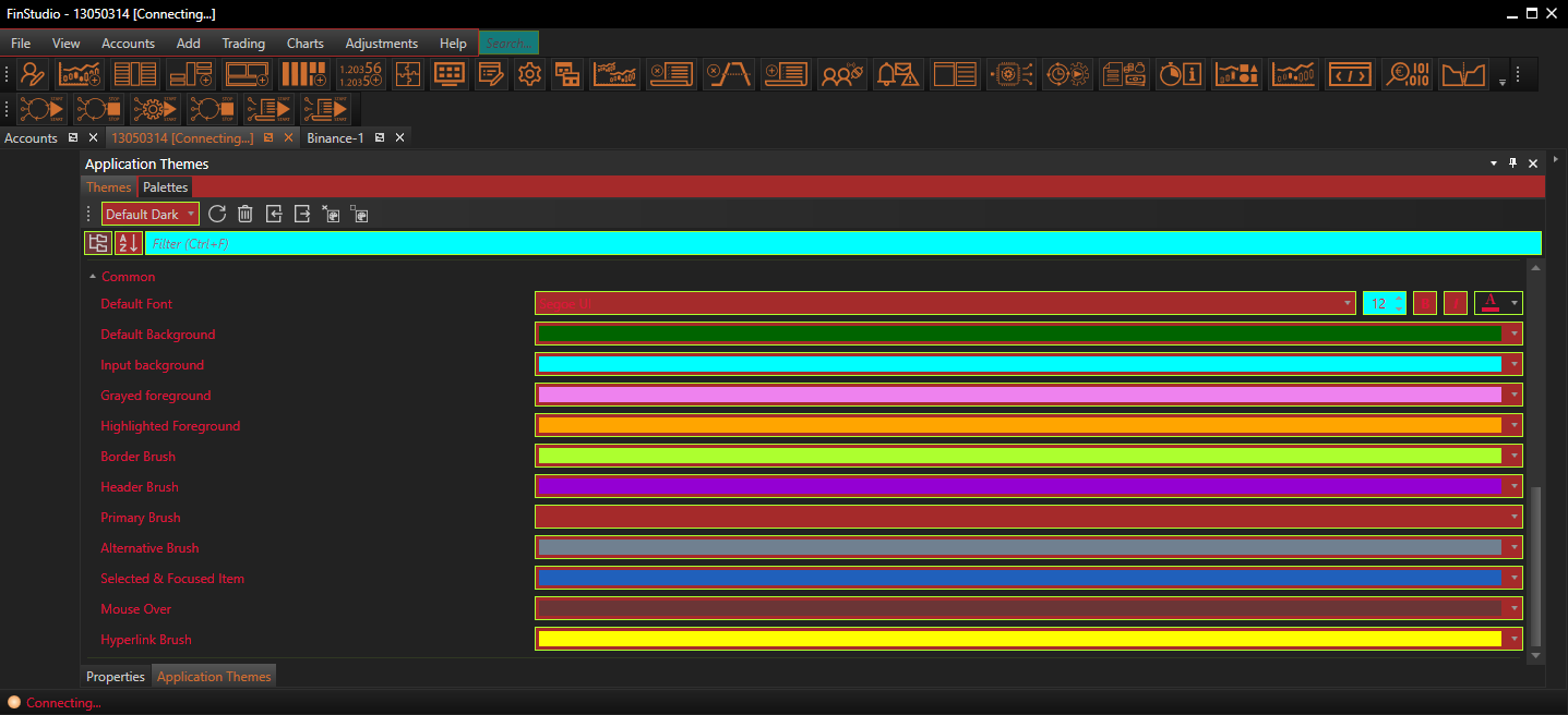
Customizing Common Properties
Default Font:
- Functionality: Sets the default font, including type, size, and color, used throughout the application.
- Impact: A consistent font ensures that text is uniformly readable and aesthetically pleasing across all modules and components, contributing to overall visual harmony.
Default Background:
- Functionality: Determines the default background color used across the application.
- Impact: The background color sets the tone of the interface and affects the visibility of UI elements. Choosing an appropriate color can reduce eye strain and improve the user’s focus.
Input Background:
- Functionality: Specifies the background color for all input fields across the application.
- Impact: Consistent input field backgrounds help users easily identify areas where data can be entered, enhancing usability.
Greyed Background:
- Functionality: Sets the background color for UI elements that are disabled or unavailable.
- Impact: A distinct greyed background alerts users to inactive elements, preventing unintended interactions and clarifying functionality.
Highlighted Background:
- Functionality: Defines the background color for elements that are highlighted or active.
- Impact: Highlighting active elements helps guide the user’s attention and indicates the current focus within the application.
Border Brush:
- Functionality: Sets the default color for borders across the application.
- Impact: Borders define the edges of elements, enhancing structural clarity and visual separation.
Header Brush:
- Functionality: Determines the default color for headers across the application.
- Impact: Uniform header colors help in identifying section starts and categorizing content, which is essential for navigation and information retrieval.
Primary and Alternative Brush:
- Functionality: Sets the primary and alternative colors used throughout the application.
- Impact: These colors can be used to emphasize important elements (primary) and provide visual diversity (alternative) without compromising the design coherence.
Selected & Focused Item:
- Functionality: Specifies the color for all selected and focused items within the application.
- Impact: Consistent colors for selected and focused items ensure that users can easily track their interactions and selections.
Mouse Over:
- Functionality: Sets the color displayed when the mouse hovers over elements.
- Impact: A distinct mouse-over color improves interactivity feedback, enhancing user engagement and responsiveness.
Hyperlink Brush:
- Functionality: Defines the color for all hyperlinks across the application.
- Impact: Distinguishing hyperlinks with a specific color aids in their identification and encourages user interaction.
Implementing Changes: Steps for Customization
-
Access Common Properties:
- Navigate to the 'Common' category within the Theme Tab of the Application Themes module to start adjusting the universal design settings.
- Navigate to the 'Common' category within the Theme Tab of the Application Themes module to start adjusting the universal design settings.
-
Modify Visual Elements:
- Use the provided controls to adjust the settings for fonts, backgrounds, brushes, and other common elements. These settings should be previewed in real-time to assess their impact across various application components.
-
Apply and Evaluate:
- After configuring the desired settings, apply the changes to update the application’s appearance. It’s crucial to review these changes across different modules to ensure consistency and functionality.
Best Practices
-
Visual Consistency:
- Ensure that all common settings promote a cohesive look and feel. Consistency in design elements like fonts, colors, and borders reduces cognitive load and enhances user experience.
- Ensure that all common settings promote a cohesive look and feel. Consistency in design elements like fonts, colors, and borders reduces cognitive load and enhances user experience.
-
Contrast and Readability:
- Select colors and fonts that provide optimal contrast for readability and accessibility. This is particularly important for elements like input fields and hyperlinks, where clarity directly impacts usability.
- Select colors and fonts that provide optimal contrast for readability and accessibility. This is particularly important for elements like input fields and hyperlinks, where clarity directly impacts usability.
-
Testing Across Environments:
- Test the appearance and functionality of these common elements under various operating conditions and on different devices to ensure that they remain effective and visually appealing regardless of the user’s environment.
Conclusion
Setting the Common properties in FinStudio's Application Themes module is key to creating a user-friendly and visually cohesive trading platform. By carefully selecting universal design settings, users can ensure that the application not only looks professional but also facilitates an efficient and engaging user experience.