Overview
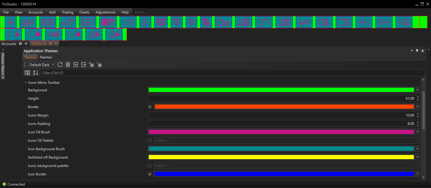
The Icons Menu Toolbar properties section within FinStudio's Application Themes module provides a detailed interface for customizing the visual aspects of the icon toolbars across the platform. This section focuses on enhancing the aesthetic and functional aspects of the icons and their toolbars, allowing for a tailored user experience that aligns with the overall visual theme of the application.
Customizing Icons Menu Toolbar Properties
Background:
- Functionality: Sets the background color of the icon toolbar.
- Impact: The background color serves as a visual base for the icons, influencing the overall look of the toolbar and how well the icons stand out.
Height:
- Functionality: Determines the height of the icons toolbar.
- Impact: Adjusting the toolbar height can enhance or reduce the prominence of the toolbar within the user interface, affecting both aesthetics and the ease of icon interaction.
Border Visible & Brush:
- Functionality: Allows users to toggle the visibility of the toolbar border and change its color.
- Impact: A visible border can help define the toolbar's boundaries and enhance its visual separation from other interface elements.
Icons Margin:
- Functionality: Sets the margin or space between individual icons.
- Impact: Adequate spacing prevents the toolbar from appearing cluttered and ensures that each icon is easily clickable.
Icons Padding:
- Functionality: Adjusts the padding around all four sides of each icon.
- Impact: Padding around icons enhances the ease of interaction and can prevent accidental presses, improving user experience.
Icon Fill Brush:
- Functionality: Specifies the color of the icons themselves.
- Impact: Color choices can significantly affect icon visibility and user recognition, especially in varying lighting conditions or on different device displays.
Icon Fill Palette:
- Functionality: Allows the icons' colors to be filled based on a selected color palette.
- Impact: Utilizing a palette ensures consistent and thematic coloring across all icons, enhancing the overall cohesiveness of the application's design.
Icon Background Brush:
- Functionality: Sets the background color directly underneath each icon.
- Impact: This setting can create a contrast between the icon and its immediate background, enhancing visibility and aesthetic appeal.
Switched Off Background:
- Functionality: Determines the background color underneath the button icons that show an "off" state.
- Impact: Differentiating the off state visually helps users quickly understand the status of toggled features.
Icons Background Palette:
- Functionality: Enables background colors for icons based on a selected color palette.
- Impact: Like the icon fill palette, this ensures consistent background coloring that complements the overall theme.
Icon Border Visible & Brush:
- Functionality: Configures the visibility and color of borders around the icons.
- Impact: Borders can highlight the icons and improve the interface's visual structure, making icons more distinct.
Steps for Customization:
-
Navigate to Icons Menu Toolbar Properties:
- Access this customization by selecting the 'Icons Menu Toolbar' category within the Theme Tab of the Application Themes module.
- Access this customization by selecting the 'Icons Menu Toolbar' category within the Theme Tab of the Application Themes module.
-
Adjust Visual Elements:
- Utilize the provided controls to modify the background, height, borders, margins, paddings, and icon colors. Each setting typically offers a preview option to immediately observe the impact of the adjustments.
- Utilize the provided controls to modify the background, height, borders, margins, paddings, and icon colors. Each setting typically offers a preview option to immediately observe the impact of the adjustments.
-
Implement Changes:
- After making the desired changes, apply them to update the toolbar’s appearance. This real-time application helps in fine-tuning the aesthetics and ensuring the modifications meet the user's expectations.
Best Practices:
-
Consistency Across Toolbars:
- Maintain a consistent design across all toolbars within the application to ensure a cohesive look. This includes matching background colors, icon styles, and border treatments where applicable.
- Maintain a consistent design across all toolbars within the application to ensure a cohesive look. This includes matching background colors, icon styles, and border treatments where applicable.
-
Adequate Spacing for Usability:
- Ensure there is sufficient margin and padding around icons to prevent mis-clicks and enhance the ease of use. Adequate spacing is crucial in high-stress environments like trading where rapid toolbar interactions are common.
- Ensure there is sufficient margin and padding around icons to prevent mis-clicks and enhance the ease of use. Adequate spacing is crucial in high-stress environments like trading where rapid toolbar interactions are common.
-
Visual Accessibility:
- Choose icon and background colors that provide good contrast. High contrast between icons and their background enhances visibility and accessibility, making the toolbar user-friendly under various lighting conditions.
- Choose icon and background colors that provide good contrast. High contrast between icons and their background enhances visibility and accessibility, making the toolbar user-friendly under various lighting conditions.
-
Functional Aesthetics:
- While it's important to achieve an attractive toolbar, prioritize functional aspects such as the visibility of active vs. inactive states and the ease of identifying the purpose of each icon. Use color coding or styling cues to denote different types of actions or tools.
Conclusion
The Icons Menu Toolbar properties section in FinStudio's Application Themes module provides detailed control over the visual presentation of icon-based toolbars, enhancing both the functionality and aesthetic integration within the trading platform. By allowing such a high degree of customization, FinStudio empowers users to create a personalized and visually cohesive trading environment. These settings ensure that every aspect of the user interface can be finely tuned to meet individual preferences, contributing to a more engaging and productive user experience.