Overview
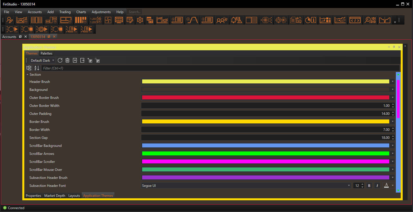
The Section properties in the Application Themes module of FinStudio provide comprehensive customization options for the visual elements of module sections within the application. This level of detail allows users to fine-tune the appearance of various components, enhancing the overall usability and aesthetic cohesion of the trading platform.
Customizing Section Properties
Header Brush:
- Functionality: Determines the color of the section header, which typically contains the module name and functional icons.
- Impact: A well-chosen header color enhances the visibility of the section titles and can be used to indicate the importance or function of the module.
Background:
- Functionality: Sets the background color for the entire section, encompassing the module's main area.
- Impact: The background color can affect the readability and visual comfort of the section, influencing how users interact with the module.
Outer Border Brush and Width:
- Functionality: These settings define the color and thickness of the border that encircles the entire section.
- Impact: Borders can frame the section distinctively within the interface, helping to define the space and separate different modules visually.
Outer Padding:
- Functionality: Adjusts the padding around the outer border of the section.
- Impact: Adequate padding can prevent the interface from feeling cluttered, providing a cleaner and more organized appearance.
Border Brush and Width:
- Functionality: Specifies the color and thickness of the borders around the individual sections within a module.
- Impact: Similar to outer borders, these settings help in visually demarcating different areas within a module, enhancing organizational clarity.
Section Gap:
- Functionality: Sets the space between the outer border and the inner borders of the section.
- Impact: This gap can be used to create a visual hierarchy or to make the interface more airy and less congested.
ScrollBar Customization:
- Background, Arrows, Scroller, Mouse Over:
- Functionality: These settings allow customization of the scrollbar's appearance, including the background, arrow buttons, scroller, and the color change on mouse hover.
- Impact: Enhancing the scrollbar’s visibility and usability can improve navigation within the module, especially in sections with extensive content.
- Functionality: These settings allow customization of the scrollbar's appearance, including the background, arrow buttons, scroller, and the color change on mouse hover.
Subsection Header Brush and Font:
- Functionality: Defines the background color and font of subsection headers within the module.
- Impact: Customizing these elements helps in distinguishing subsections clearly, aiding in quick information retrieval and enhancing readability.
Applying Section Theme Customizations
Steps for Customization:
- Access the Section Properties: Navigate to the Theme Tab within the Application Themes module and select the 'Section' category.
- Adjust Visual Elements: Use the provided controls to modify the colors, widths, and fonts as desired. Preview changes in real-time to ensure they meet your expectations.
- Apply and Save: Once the desired adjustments are made, apply the changes to see them reflected throughout the application. Save the theme to retain these settings for future sessions.
Best Practices:
- Consistency: Ensure that the visual styles across different sections are consistent unless differentiation is required for functional reasons.
- Visibility: Choose colors and fonts that maintain high visibility and contrast, ensuring that all text and interface elements are easily readable.
- Aesthetics: Consider the overall aesthetic of the application when choosing colors and styles, aiming for a professional and cohesive look.
Conclusion
Customizing the Section properties within FinStudio's Application Themes module allows users to tailor the interface to their specific needs and preferences, creating a personalized and effective trading environment. By adjusting these detailed settings, users can ensure that each module not only functions optimally but also contributes to a visually appealing and coherent workspace.